The archetypical TeV blazar Mk421 was extensively observed in 2009 during a 4.5 month-long multi-instrument campaign involving VLBA, F-GAMMA, GASP-WEBT, Swift, RXTE, Fermi-LAT, MAGIC, and Whipple, among other instruments and collaborations, covering the electromagnetic spectrum from radio to very-high-energy gamma rays. The object was found to be in a very low activity state, but showing significant variability throughout the electromagnetic spectrum, with a harder-when-brighter spectral behaviour at X-rays, and a positive correlation between the emission at X-rays and that at very-high-energy gamma rays. Such characteristics have been observed many times during flaring activity, but this is the first time that they are reported during low-activity states, indicating that the modus-operandi of this source during high and low activity are somewhat similar.
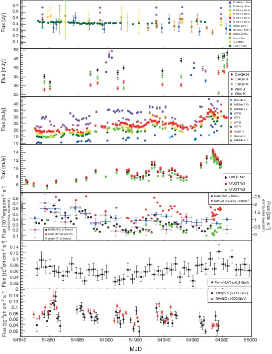
Figure 1: Light Curves of Mrk 421 from radio to VHE from 2009 January 19 (MJD 54850) to 2009 June 1st (MJD 54983). Vertical bars denote flux measurement errors, and the horizontal bars denote the time bin widths into which some of the light curves are binned. The Fermi-LAT photon fluxes are integrated over a three-day-long time interval. The Whipple 10-meter data (with an energy threshold of 400 GeV) were converted into fluxes above 300 GeV using a power-law spectrum with index of 2.5.
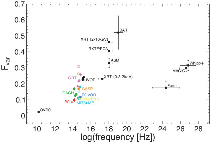
Figure 2: Fractional variability Fvar as a function of frequency. Open circles denote Fvar values in R-band calculated with the host galaxy subtracted as prescribed in Nilsson et al. (2007)
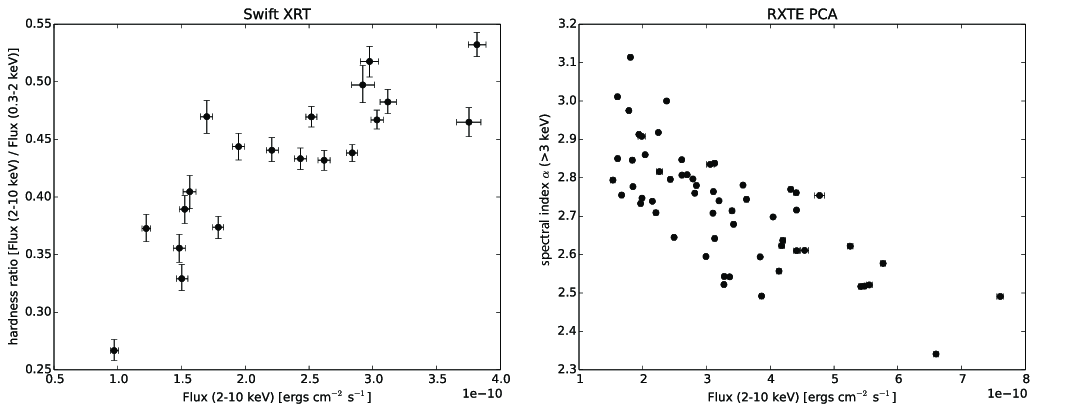
Figure 3: Left: X-ray hardness ratio for the Swift/XRT bands 2-10 keV and 0.3-2 keV vs. the X-ray flux in the 2-10 keV band. Right: Power-law index of RXTE/PCA spectra above 3 keV vs. the X-ray flux in the 2-10 keV band.
Figure 4: Success fraction as a function of power-law index α of the PSD for three selected light curves (GRT V band, RXTE/PCA and MAGIC) and a range of light curve binnings (2 - 6 days) to illustrate the e ffect of the binning. The location of the maximum does not change significantly with the binning, but there is significant variation in shape, width and amplitude.

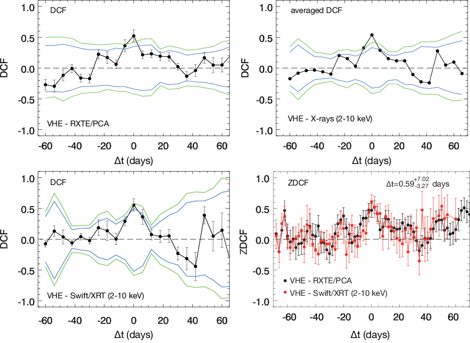
Figure 5: The DCF of the combined Whipple and MAGIC (VHE) light curve, correlated with the RXTE/PCA and the Swift/XRT (2-10 keV) light curves are shown in the upper left and lower left panels. The black error bars represent the uncertainties as derived from Edelson & Krolik (1988). The green lines represent the 1% and 99% extremes of the DCF distribution of simulated RXTE/PCA light curves when correlated with the measured VHE light curve. The blue lines represent the 5% and 95% extremes. The upper right panel shows the average of the VHE–RXTE/PCA and VHE–Swift/XRT (2-10 keV) DCFs, with the corresponding confidence intervals derived from averaging the DCFs of the simulated light curves. See text for details in the calculation of the average DCFs and contours. The lower right panel shows the z-transformed DCFs.

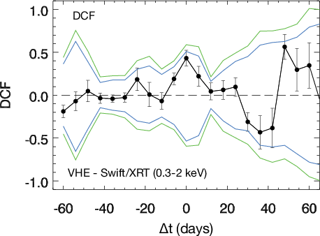
Figure 6: DCF of the combined Whipple and MAGIC (“VHE”) light curve, correlated with the Swift/XRT (0.3-2 keV) light curve. The black error bars represent the uncertainties as derived from Edelson & Krolik (1988). The green lines represent the 1% and 99% extremes of the DCF distribution of simulated Swift/XRT light curves when correlated with the measured VHE light curve. The blue lines represent the 5% and 95% extremes.
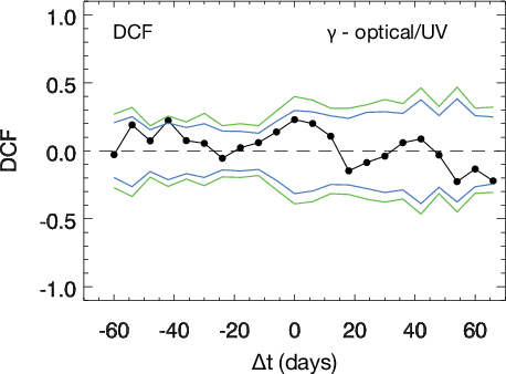
Figure 7: The average DCF of the Fermi-LAT HE γ-ray light curve, correlated with the optical and UV light curves (GASP R-band, GRT BVRI, MITSuME g, MITSuME Ic and UVOT W1), is shown in black. The green lines represent the 1% and 99% extremes of the likewise averaged DCF distribution of simulated optical/UV light curves when correlated with the real Fermi-LAT light curve. The blue lines represent the 5% and 95% extremes.

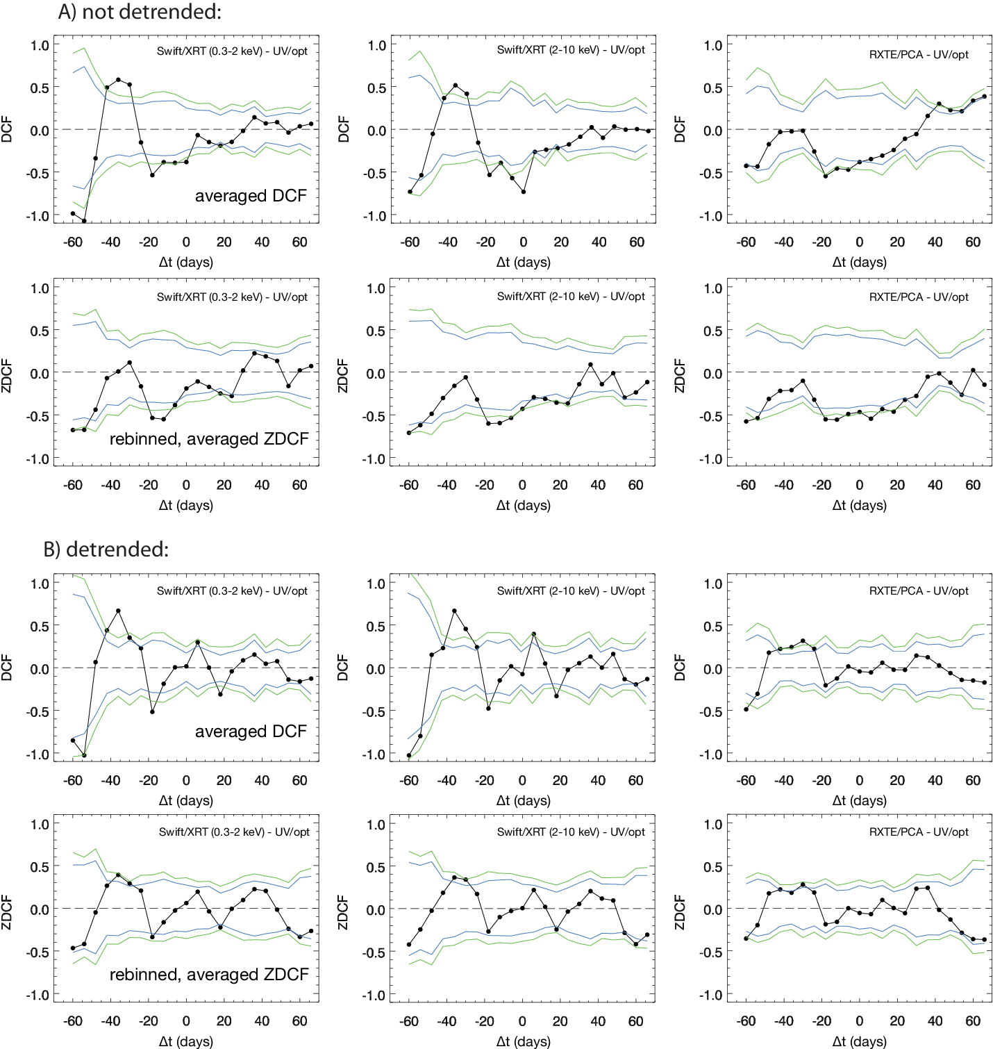
Figure 8: (A) The DCFs of each X-ray light curve (Swift/XRT (0.3-2 keV), Swift/XRT (2-10 keV) and RXTE/PCA (2-10 keV)), correlated with several optical and UV light curves, are averaged over all optical to UV bands and shown in black in the upper panel. The green lines represent the 1% and 99% extremes of the likewise averaged DCF distribution of simulated optical/UV light curves when correlated with the observed X-ray light curve. The blue lines represent the 5% and 95% extremes. The lower panel shows the z-transformed DCFs, which were, for the purpose of direct comparison with the DCF, rebinned to the same binning as the DCFs and averaged in the same way. (B) shows the same as (A), but all light curves have been detrended (as described in 4.3) before correlation.

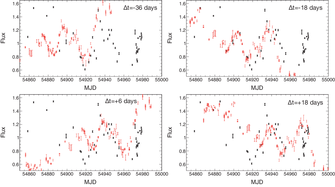
Figure 9: Example plots to illustrate the correlation between the optical and the X-ray flux variations. All four panels show the normalized Swift/XRT (0.3-2 keV) light curve in black. The GASP R-band light curve, normalized and rescaled to match the same flux range as the Swift/XRT light curve, is overplotted in red with diff erent time lags t = -36, -18, +6, and +18 days. In case of
anti-correlation ( t = -18 and +18 days), the GASP light curve is also flipped vertically.

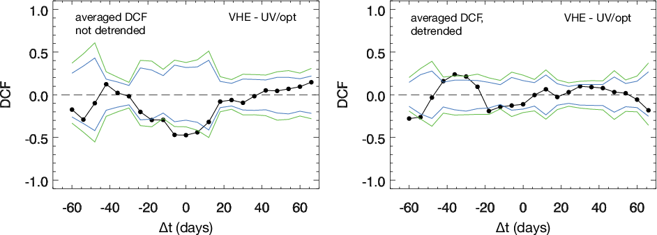
Figure 10: The average of the DCFs of the combined Whipple and MAGIC (VHE) light curve, correlated with several optical and UV light curves, are shown in black in the left panel. The green lines represent the 1% and 99% extremes of the likewise averaged DCF distribution of simulated optical/UV light curves when correlated with the observed VHE light curve. The blue lines represent the 5% and 95% extremes. The right panel shows the same as the left panel, but all light curves have been detrended (i.e., fitted and subtracted by a first-order polynomial) before correlation.
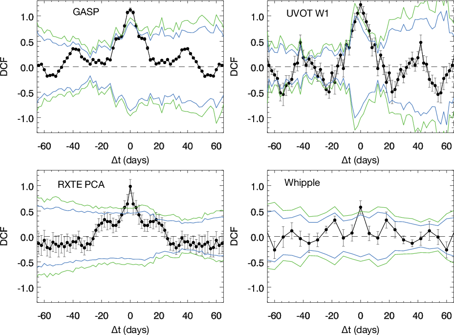
Figure 11: The discrete auto-correlation function for a few light curves are shown in black. The green lines represent the 1%and 99% extremes of the likewise averaged DACF distribution of simulated light curves when correlated with themselves. The blue lines represent the 5% and 95% extremes.
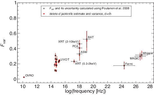
Figure A1: Measured fractional variability Fvar (black) compared with a delete-d jackknife estimate (red) with d = √N, for all light curves with a minimum of 15 data points.
Figure A2: Fractional variability Fvar (red) as a function of (N - d)=N for the jackknife-d samples of selected representative light curves. The measured Fvar of the original light curve and its error are shown as red horizontal lines. The Fvar of the jackknife samples is constant and agrees with the original Fvar within its errors for all but the largest d (i.e., the smallest jackknife samples).
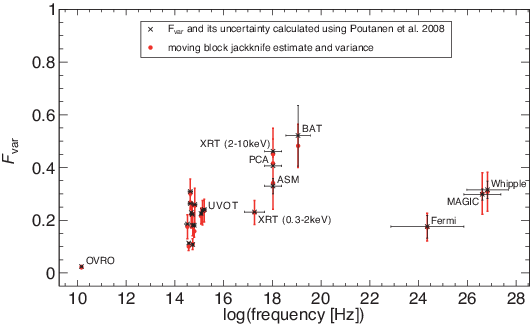
Figure A3: Measured fractional variability Fvar (black) compared with a moving-block jackknife estimate (red), using a blocksize of m =3√N, for all light curves with a minimum of 15 data points.
